🎥 Watch this short video for a quick overview before exploring the detailed breakdown of dashboard charts and metrics below.
- Structure
- Conversation Dashboard
- Conversation Volume by Customer Sentiment
- Conversation Table
- Most Frequent Topics in Customer Messages per Month
- Most Frequent Topics in Conversations
- Customer Dashboard
- Customer Table
- Topic Map – Customer Messages
- Phrase Cloud – Customer Messages
- Most Frequent Topics in Customer Messages
- Most Frequent Reasons of Contact
- Agent Dashboard
- Distribution of Conversations by Agent Sentiment
- Agent Table
- Topic Map – Agent Messages
- Phrase Cloud – Agent Messages
- Most Frequent Topics in Agent Messages
- Most Frequent Reasons of Contact
- Conversation Feed & Drill down
- Extended view - metadata panel (1)
- Extended view - main panel
- Extended view - Text Analytics Tab
- Drill down
Structure
The Conversation Dashboard is designed to provide structured insights into different dimensions of your conversational data. It enables analysis from multiple perspectives, including:
- Conversations as a whole
- Individual conversations
- Customer records
- Agent records
To support these views, the dashboard is organized into four dedicated tabs, following a consistent logic and layout:
- Conversation dashboard (1)
- Conversation feed (4)
- Customer dashboard (2)
- Agent dashboard (3)
To ensure optimal performance when handling large datasets, a default date filter (last 7 days) is applied across all dashboard tabs.
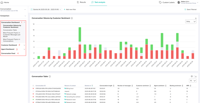
Conversation Dashboard
The Conversation Dashboard serves as the central interface for analyzing conversations, providing aggregated insights at the conversation level. It allows users to explore filtered conversation data together with associated metadata, supporting the tracking of key performance indicators and customer experience metrics.
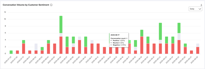
Conversation Volume by Customer Sentiment
This stacked column chart displays the number of customer conversations over time.
Each column's height represents the total conversations for the period, with segments in red (negative), grey (neutral), and green (positive) indicating the sentiment based solely on customer messages (agent messages are excluded).
Data aggregates automatically by day (up to 30 days), by week (beyond 30 days), or by month (beyond 180 days).
You can export the chart as a PNG using the export icon at the top right corner.
Conversation Table
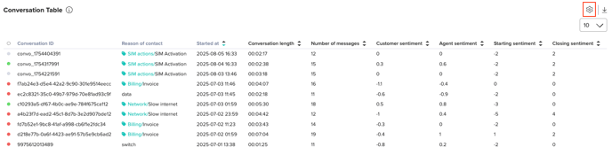
The Conversation Table is the primary visualization element, presenting a structured list of conversations alongside key metadata. Users can apply filters to refine the dataset based on selected criteria.
You can export the table as an xlsx file using the export icon in the top-right corner.
To modify the displayed metadata columns, click the cog icon and customize the table layout according to your preferences.
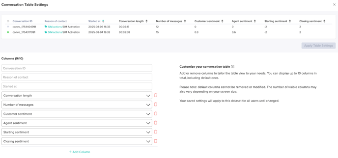
Fixed Columns (Non-Removable)
These columns are always displayed and contain essential information for identifying and analyzing conversations:
- Conversation ID – Unique identifier for each conversation.
- Started At – The table is ordered by timestamp in descending order by default.
- Reason for Contact – Primary topic identified from the customer's first message
Default Columns (Configurable by Users)
These columns are visible by default but can be reordered or adjusted as needed:
- Conversation Length – Total duration of the conversation.
- Number of Messages – Total count of individual messages within the conversation.
- Customer Sentiment – Aggregated sentiment score of all customer messages.
- Agent Sentiment – Aggregated sentiment score of all agent messages.
- Starting Sentiment – Sentiment score of the first customer message in the conversation.
- Closing Sentiment – Sentiment score of the final customer message in the conversation.
Additional Columns (Fully Customizable)
Users can add numeric or categorical metadata fields, such as NPS, CES, customer group, or file name (e.g., .wav). These fields can be used to sort conversations by selected metrics.
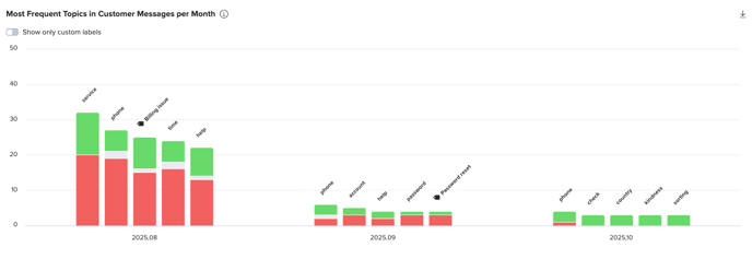
Most Frequent Topics in Customer Messages per Month
This grouped stacked column chart displays the 5 most frequent Labels and Custom Labels in customer conversations in each period over time.
Data is aggregated exclusively from customer messages, with each conversation contributing a single count per label or Custom Label, regardless of multiple mentions. When a label or Custom Label appears several times within a conversation, its sentiment is calculated as the average of those mentions. This average determines the color of the segment (red for negative, grey for neutral, green for positive).
The horizontal axis represents the date period, while the vertical axis shows the number of conversations.
Data is aggregated daily by default, switching to weekly aggregation when the selected period exceeds 7 days, with a maximum display period of 3 months.
To display only Custom Labels, use the toggle switch located above the table.
You can export the chart as a PNG using the export icon in the top-right corner.
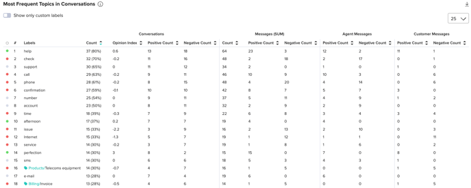
Most Frequent Topics in Conversations
This table lists the most frequently mentioned Labels and Custom Labels across conversations, aggregating data from both agent and customer messages.
Within a single conversation, if a label or Custom Label appears multiple times, it is counted only once. The same rule applies to multiple occurrences within a single message.
The table’s columns are fixed and cannot be modified.
To display only Custom Labels, use the toggle switch located above the table.
You can export the table as an xlsx file using the export icon in the top-right corner.
Customer Dashboard
The Customer Dashboard provides insights into customer interactions by aggregating and analyzing Custom Labels (CLs) and system-generated labels from customer records. It allows users to track customer sentiment, engagement patterns, and key conversation topics, helping identify customers with strongly positive or negative experiences.
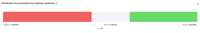
Distribution of Conversations by Customer Sentiment
This chart shows the distribution of conversations according to overall customer sentiment.
The sentiment of each conversation is calculated by summing the sentiment scores of all individual customer messages. Conversations are then categorized as Positive, Neutral, or Negative based on the resulting total score.
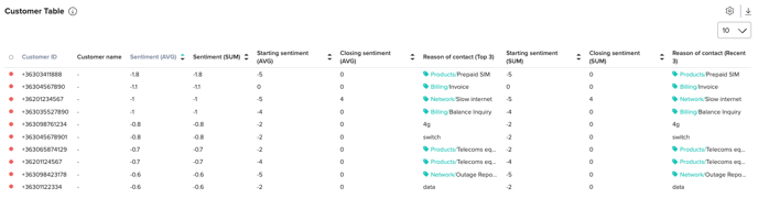
Customer Table
The Customer Table is the primary visualization component in this dashboard. It presents customers based on their conversation history, current filters, and sorting preferences. Users can:
- Customize displayed metadata to tailor insights.
- Sort numeric columns in ascending or descending order using the chevrons in the headers.
- Identify key sentiment trends and conversation topics associated with individual customers.
Fixed Columns (Non-Removable)
These columns are always displayed:
- Customer ID – Unique identifier for the customer.
- Sentiment (AVG) – Average sentiment score of the customer, used as the default sorting metric in ascending order.
Default Columns (Configurable by Users)
Displayed by default, these columns can be customized or reordered:
- Customer Name – If available, the customer’s display name.
- Number of Conversations – Total conversations linked to the customer.
- Average Conversation Length – Mean duration of the customer’s conversations.
- Top 3 Reasons of Contact – Primary topics identified from the customer’s first message
- Sentiment (SUM)
- Number of messages
- Starting sentiment (AVG)
- Closing sentiment (AVG)
Additional Columns (Fully Customizable)
Users can add numeric or categorical metadata fields — for example, NPS, CES, customer group, or .wav file names. Numerical columns can be used to sort customers based on selected metrics. Numerical values such as sentiment can be displayed as average or sum, while categorical values such as Reason of contact can show top 3 or most recent 3 values.
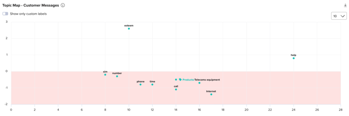
Topic Map – Customer Messages
This chart visualizes the most frequent Labels and Custom Labels recognized in customer messages. The y-axis represents sentiment values, and the x-axis represents frequency.
Use the toggle switch to view only Custom Labels if desired.
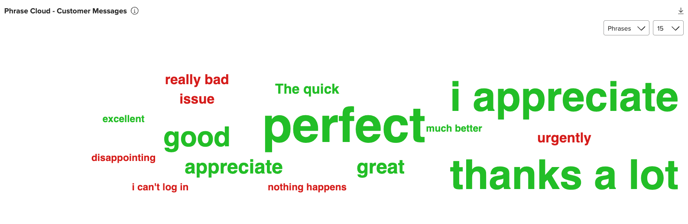
Phrase Cloud – Customer Messages
This chart displays the most frequently identified phrases or labels (including Custom Labels) from customer messages. Users can switch between phrases and labels, and clicking on any item drills down to show the associated conversations.
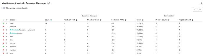
Most Frequent Topics in Customer Messages
This table lists the most frequently recognized Labels and Custom Labels in customer-authored messages.
- Customer Messages / Count shows how often each topic appeared in customer messages.
- Conversations / Count indicates the number of unique conversations containing each topic; multiple mentions in a single conversation count as one.
Numeric columns can be sorted in either direction using the chevrons in the headers. By default, the table is sorted descending by Customer Message Count, surfacing the most commonly used topics first.
The number of visible rows per page can be adjusted (10, 25, 50, 75, 100, or 150) using the dropdown at the top right.
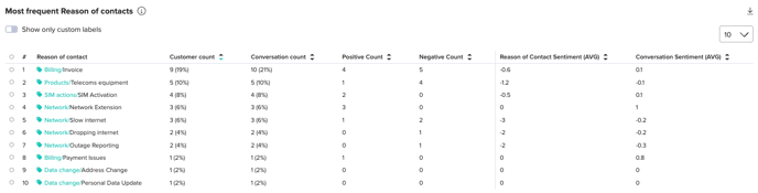
Most Frequent Reasons of Contact
This table displays the most frequently identified Reasons of Contact across conversations.
- Customer Count – Number of unique customers associated with each reason. Multiple conversations from the same customer with the same reason are counted only once.
- Conversation Count – Number of unique conversations where the label was recognized as the reason for contact.
- Reason of Contact Sentiment (AVG) – Average sentiment for messages linked to the reason, calculated across all relevant conversations.
- Conversation Sentiment (AVG) – Average overall sentiment of conversations where the reason was identified.
Agent Dashboard
The Agent Dashboard provides insights into agent performance and interactions by aggregating and analyzing Custom Labels (CLs) and other assigned labels from agent records. It enables users to identify high- and low-performing agents, track sentiment trends, and evaluate conversation quality based on structured data.
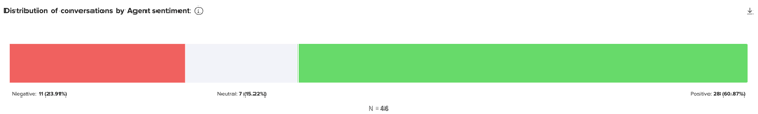
Distribution of Conversations by Agent Sentiment
This chart shows the distribution of conversations according to overall agent sentiment.
The sentiment of each conversation is calculated by summing the sentiment scores of all individual agent messages. Conversations are then categorized as Positive, Neutral, or Negative based on the resulting total score.
Agent Table
The Agent Table is the primary visualization component, presenting agent data based on their conversation history. Users can:
- Customize displayed metadata.
- Reorder columns and sort numeric data in ascending or descending order.
- Identify top-performing and underperforming agents.
- Analyze agent sentiment trends across multiple conversations.
- Determine the most frequently discussed topics handled by each agent.
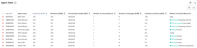
Fixed Columns (Non-Removable)
- Agent ID – Unique identifier for the agent.
- Sentiment (AVG) – Aggregated sentiment score for all messages sent by the agent. By default, sorted descenting to display most underperforming agents.
Default Columns (Configurable by Users)
- Agent Name – If available, the agent’s display name.
- Number of Conversations – Total conversations handled by the agent.
- Average Customer Opinion Index – Aggregated sentiment score of customer messages in the agent’s conversations (table is ordered ascending by default).
- Average Conversation Length – Mean duration of conversations handled by the agent.
- Top 3 Reasons of Contact – Primary topics identified from customers’ first messages, aggregated across all conversations handled by the agent.
- Agent sentiment (SUM) - Sum of the agent messages’ opinion index
- Number of messages - Sum of agent messages
Additional Columns (Fully Customizable)
Users can add numeric or categorical metadata fields, such as NPS, CES, customer group, or .wav file names. Numerical fields can be used to sort agents based on selected metrics. Numerical values such as sentiment can be displayed as average or sum, while categorical values such as Reason of contact can show top 3 or most recent 3 values.
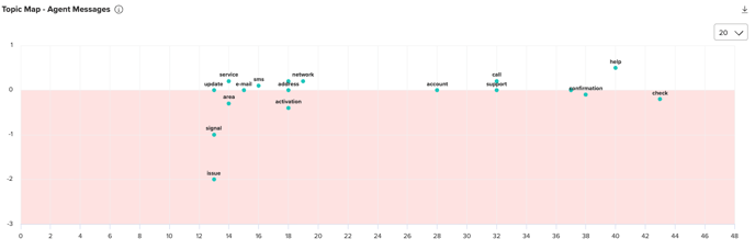
Topic Map – Agent Messages
This chart visualizes the most frequent Labels and Custom Labels identified in agent messages. The y-axis represents sentiment values, and the x-axis represents frequency.
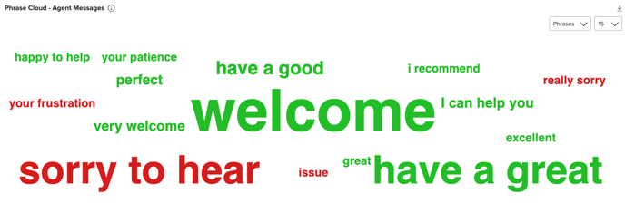
Phrase Cloud – Agent Messages
This chart displays the most frequently identified phrases or labels (including Custom Labels) within agent messages. Users can switch between phrases and labels, and clicking any item drills down to show the associated conversations.
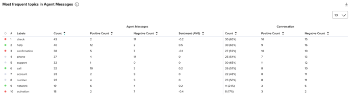
Most Frequent Topics in Agent Messages
This table shows the most frequently recognized Labels and Custom Labels in agent-authored messages.
- Agent Messages / Count indicates how often each topic appeared in agent messages.
- Conversations / Count shows the number of unique conversations containing the topic; multiple mentions in a single conversation count only once.
Numeric columns can be sorted in both directions using the chevrons in the headers. By default, the table is sorted descending by Agent Message Count, surfacing the most common topics first.
The number of visible rows per page can be adjusted (10, 25, 50, 75, 100, or 150) via the dropdown in the top-right corner.
Most Frequent Reasons of Contact
This table displays the most frequently identified Reasons of Contact across conversations:
- Agent Count – Number of unique agents associated with each reason. Multiple conversations handled by the same agent for the same reason count only once.
- Conversation Count – Number of unique conversations in which the label was recognized as the reason for contact.
- Reason of Contact Sentiment (AVG) – Average sentiment score for messages linked to the topic, calculated across all relevant conversations.
- Conversation Sentiment (AVG) – Average overall sentiment of conversations where the reason was identified.

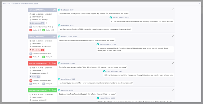
Conversation Feed & Drill down
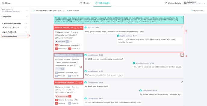
The Conversation Feed is the primary interface for browsing individual conversations within a dataset. It presents a structured list of conversations, each shown as a concise, scannable summary.
The feed is accessible from the left menu (1). One feed list element represents one conversation (2). The left side (3) of each list element contains conversation metadata, while the right side shows a snippet of the exchange — always including the customer message that indicates the reason for contact, ideally with the preceding and following messages for context. Use the expand action (4) to open an extended view that reveals the full discussion, all metadata, and analytical insights derived from the text analysis.
Extended view - metadata panel (1)
The left panel of the extended view displays conversation-level metadata and quick facts:
- Conversation ID
- Number of messages in the conversation
- Exact starting date and time of the conversation
- Conversation duration
- Customer ID and name if available
- Agent ID and name if available
- Reason of contact — identified as the first Label or Custom Label detected in customer messages during the conversation
- Customer Opinion Index (AVG) — the average of the individual customer messages’ Opinion Index values
- Starting OI — Opinion Index of the first customer message
- Closing OI — Opinion Index of the last customer message
- All metadata submitted as Conversation Metadata or Message Metadata
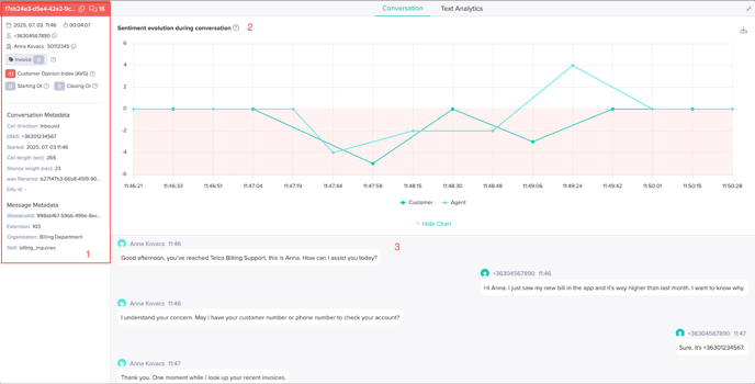
Extended view - main panel
At the top of the main panel is the Sentiment evolution during conversation chart (2). This chart shows sentiment changes across the interaction, based on each utterance or message from the customer and agent. The x-axis marks timestamps for each message (only moments when someone speaks or writes are shown, so the timeline is irregular), and the y-axis shows the sentiment score (Opinion Index) assigned to each entry. Two lines plot sentiment trends separately for the customer and the agent, enabling visualization of tone and emotional dynamics over time.
Below the sentiment chart, the full conversation is available for reading.(3)
Switch to the Text Analytics tab of the extended view to access additional analytical insights.
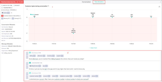
Extended view - Text Analytics Tab
The Customer topics during conversation chart (1) displays recognized topics for each customer message throughout the interaction. For each customer entry, up to three topics may be identified and shown as dots. Only messages that contain at least one recognized topic are included. Each dot’s vertical position represents the topic’s sentiment, and its horizontal position corresponds to the message start timestamp. Note that most messages are short conversational turns and typically only one topic is recognized per entry.
Below this chart, all messages (customer and agent) are shown in an analysis view with recognized Labels and Custom Labels and sentiment coloring (2).
Drill down
The list of conversations (feed) is also accessible through the Drill Down function available on multiple charts and tables.
By clicking on any data series in a chart or on a label or Custom Label in a table, you can view either:
- The list of related conversations, or
- The extended view of a single conversation (if the selected data point represents only one conversation, e.g. in the Conversation Table).
When accessed via Drill Down, the feed provides the same functionality and interaction options as when opened directly from the left-side menu.