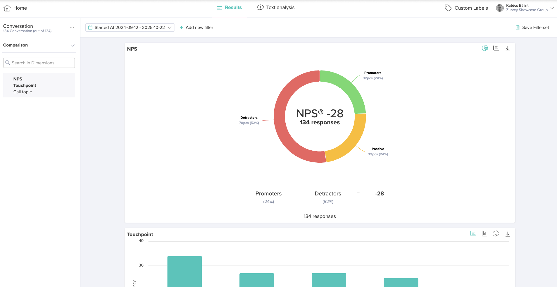
Similarly to other dataset types, the Results Dashboard summarizes and visualizes the non-textual data of the conversation datastream.
The charts displayed in this section vary depending on the type of metadata included in the dataset.
Based on the metadata and dimension setup, the dashboard may present visualizations such as NPS distribution, touchpoints, call direction distribution, support agent groups, silence length distribution, or call length distribution, among others.
Each chart offers two to three visualization modes, which you can toggle between using the icons in the top-right corner of the chart.
For more information about navigation and the available visualization options, refer to the Results Dashboard entry in the Knowledge Hub dedicated to this topic.